Using Dashboard
The following examples demonstrate how to monitor conversation handling in your service center.This is done by adding cards to the Statistics view in Dashboard.
Dashboard is the application where you define which queues to monitor, which metrics to show, and how the information is presented.
To illustrate how the Dashboard UI works, we’ll add two cards:
- one that shows how many conversations are currently in the queue, and
- another that shows which agents are serving that queue.
Prerequisites
You need the following rights:
- Rights to either view or serve in queues/queue groups or statistics summary or statistics details for queues/queue groups
- Statistics summary for users
The colors and scale of the gauge or bar in the card In queue are based on the settings configured in System Configurator (SC). Check that the following values have been set for the queues you selected:
Queue or channel setting Answered-on-time limit: The gauge and bar overall scaling are based on the values defined for this setting.
Queue level setting Warning level of queuing time: When the queuing time exceeds the defined value, the gauge, bar, and numeric will turn yellow.
Queue level setting Critical level of queuing time: When the queuing time exceeds the defined value, the gauge, bar, and numeric will turn red.
Monitoring conversations in the queue
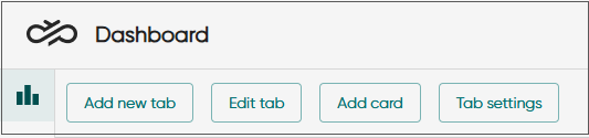
- In the Statistics view, add a new tab or use the initial
tab My statistics.
If you feel that the tab name is not descriptive enough for your purpose, rename it by clicking Edit tab, change the name and click OK.
To create a new tab, click Add new tab, enter a name for it, and click OK.
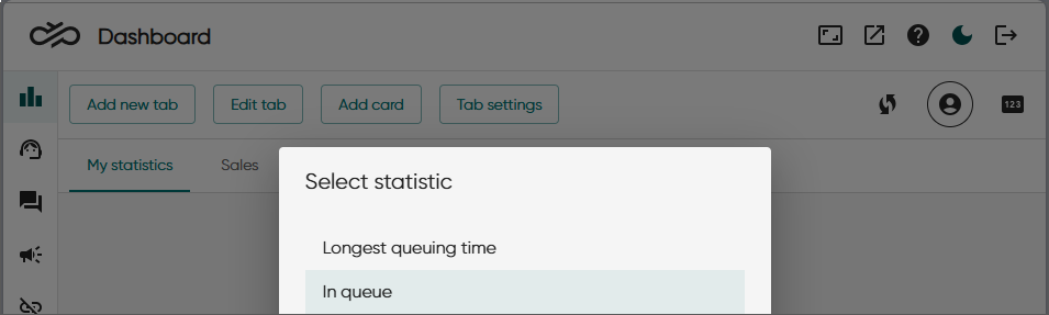
- Click Add card and select In
queue.
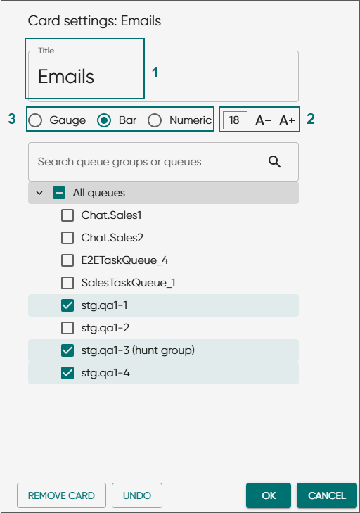
Your card can contain a mix of channel types, such as calls, emails, and chats.
-
Keep the name or enter a new one (1). You can also adjust the font size (2).
The changed font size will be shown when the card is added to the Statistics view.
-
Choose how to visualize the information (3).
-
Select the queues and click OK.
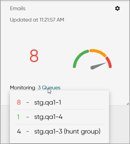
The card is added to the view.
When multiple queues are selected, the card shows statistics for the queue with the longest waiting time. Clicking the queues link shows all queues selected for the card and the number of conversations waiting in each queue.
Monitoring agent availability in the queue
-
In the Statistics view, click Add card and select Queue status.
-
Keep the name of the card or enter a new one.
-
Select the queues and click OK.
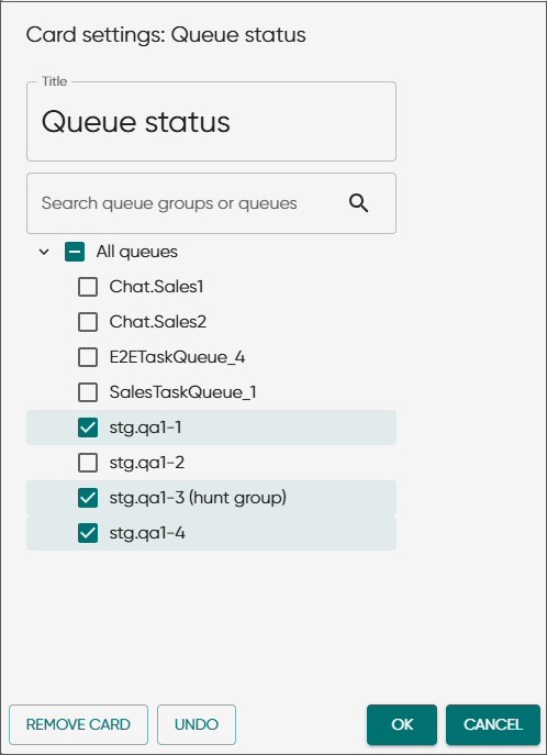
The card is added to the view.
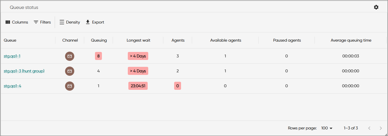
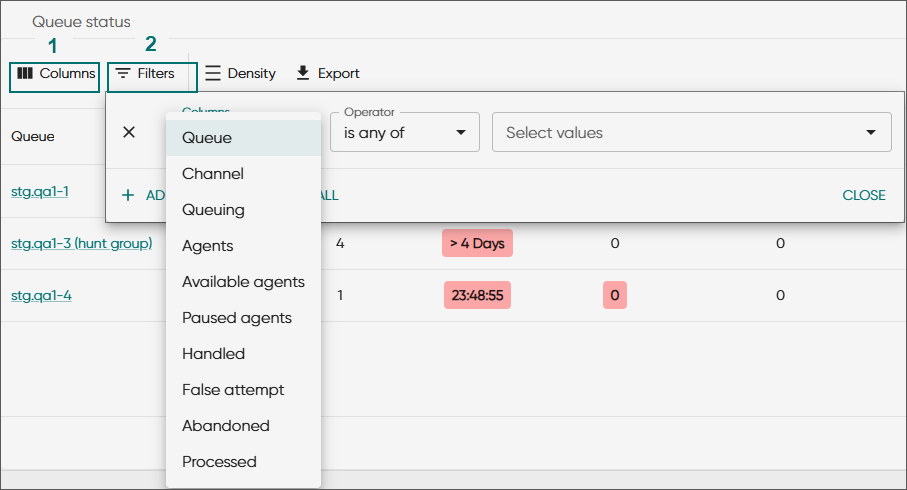
To select or deselect information shown in the table, click Columns (1). If you have a long list of queues, use Filters (2) to narrow down shown queues.
The queue name works as a link. It goes to the Queues tab in the Agents view showing the agents' queue assignments.
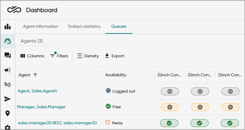
If you want to see details of the agents' availability (for example how long they've been free/busy/away) use the card Serving status.
Wallboard view and carousel mode
You can also view the statistics in full-screen mode.
Click the wallboard view icon.
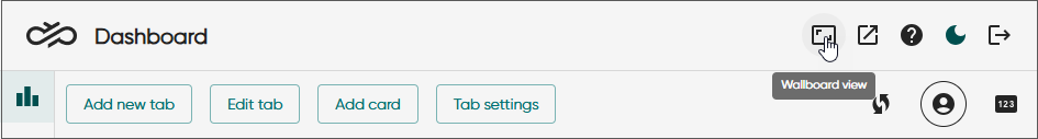
Now you can drag the view to a different display and show only the selected statistics as the browser's address bar and other settings are hidden.
You can also resize and move the cards in the wallboard view.
To leave the view, click the wallboard view icon
 again or
press the Esc key.
again or
press the Esc key.
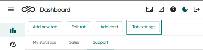
If you have added several tabs, you can enable the carousel mode. Using carousel mode in wallboard view will allow showing more cards.
Click Tab settings.
Switch on Enable carousel mode.
Select the tabs you want to include in the carousel.
By default, each tab is shown for five seconds. If you want some of the tabs, or all, to be visible longer, increase the value.
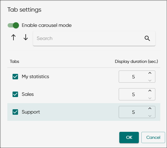
Click OK.
-
To stop the carousel mode, click on any of the buttons that opens a popup window.